A visual identity that smells of homemade cooking and tastes like tradition.
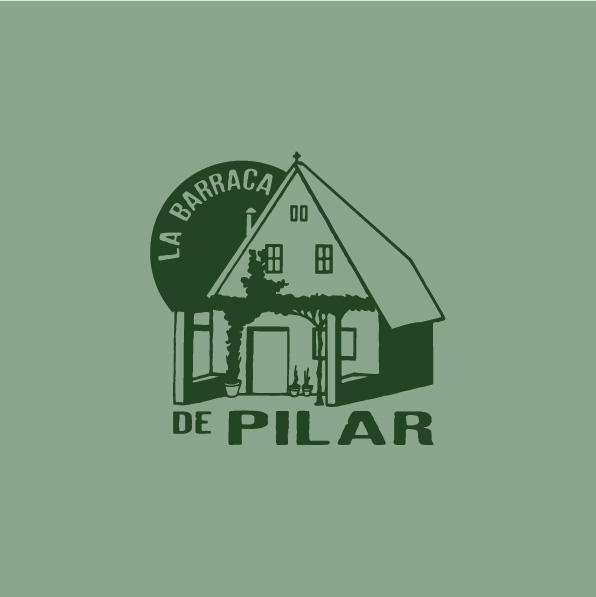
Logo of La Barraca de Pilar
At La Barraca de Pilar, every graphic detail conveys its essence: a cozy place where timeless cuisine is enjoyed without haste. Its new image combines authenticity and warmth, with a design inspired by the freshness of green tones, evoking natural ingredients and the care put into every dish.
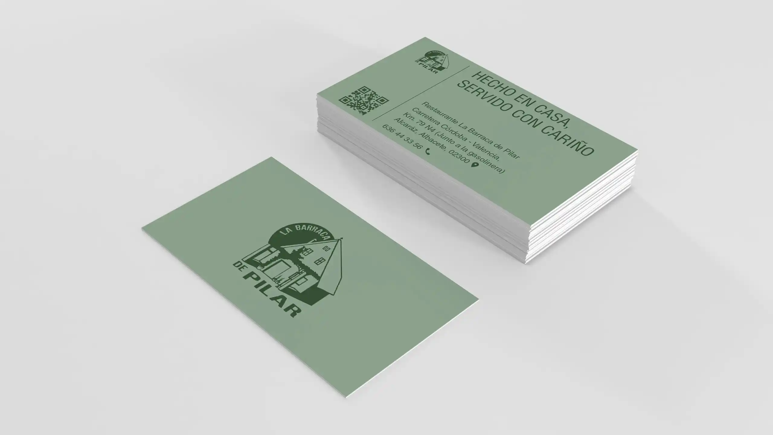
Business cards
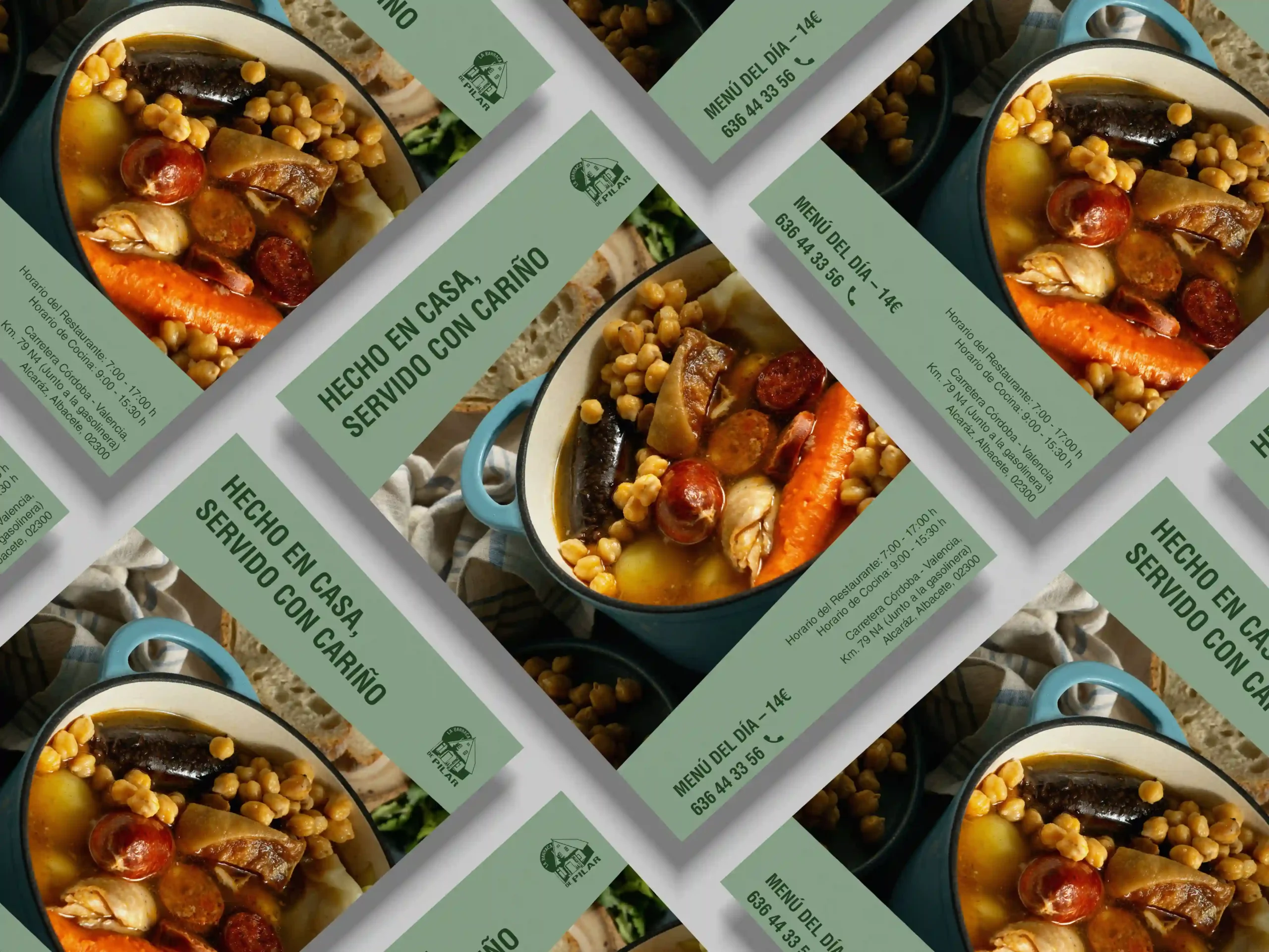
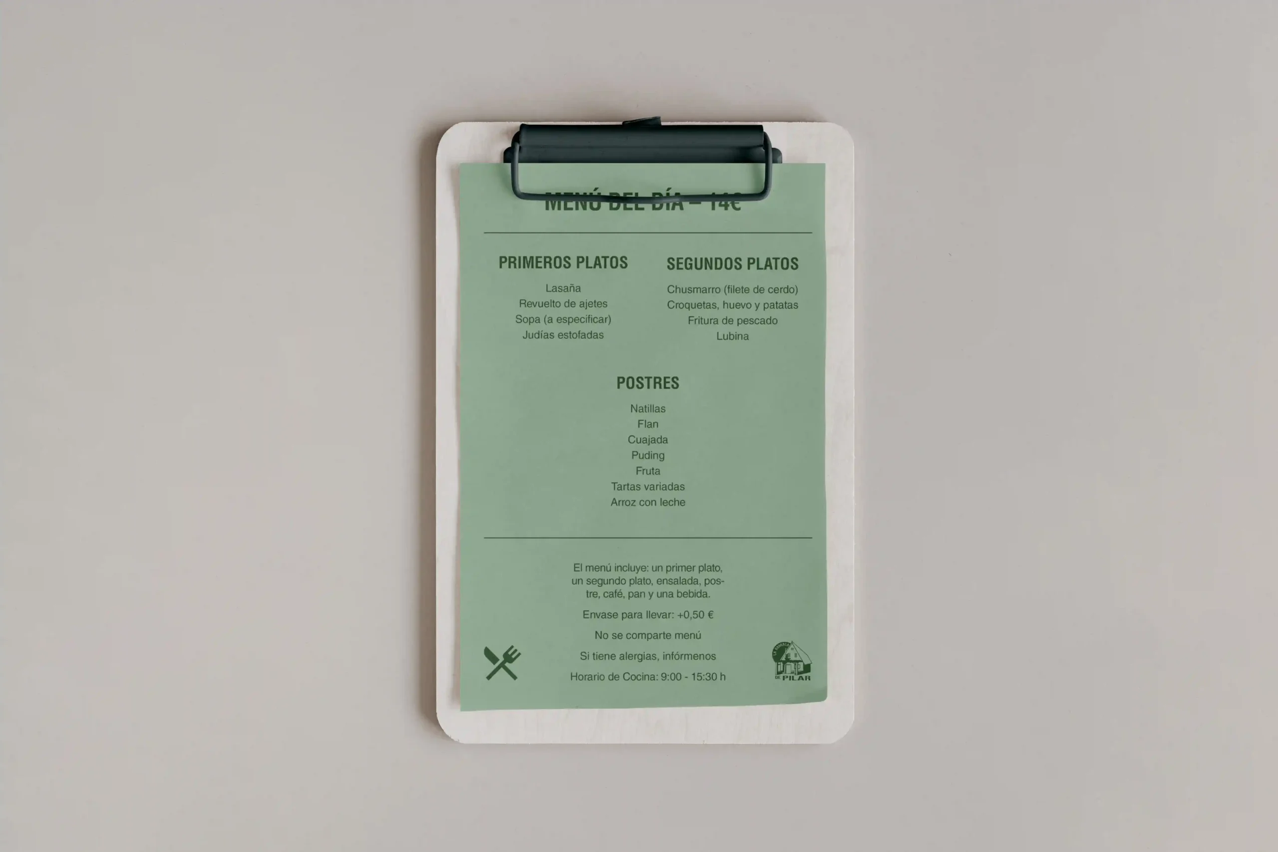
A renewed logo, flyers, menus, and business cards shape a balanced and inviting aesthetic. The green palette brings freshness and harmony, while the carefully chosen typography reflects the personality of a family space where every meal is a reunion.
Promotional flyers
Restaurant menu
Because at La Barraca de Pilar, design, like cooking, is crafted with soul and tradition.